#XboxReveal
 I was super excited for yesterday’s Xbox reveal event. Now that it’s over I’m not as excited as I was before. Initially, I was just like “oh, that was it?“. The name reveal was quite funny as my house-mates and I were on the edge of our seats as Don Mattrick said “So, it’s time” and “Ladies and Gentlemen, introducing… Xbox One”. Again “whaaat?” came to mind. None of us were expecting that. In fact, the whole show was very surprising. There was way too much about sport. Every other thing was sport. Sport on TV, sport in apps, sport in games. Oh yeah, games. There were about 3 non-sport titles, and they were very shortly talked about and then hurried away to talk about sports some more. I think there were a lot of disappointed nerds who were hoping for some more impressive game info. I’m sure they are saving it for E3, but I believe it was a bad move as Sony had a good game presence at their PS4 unveiling.
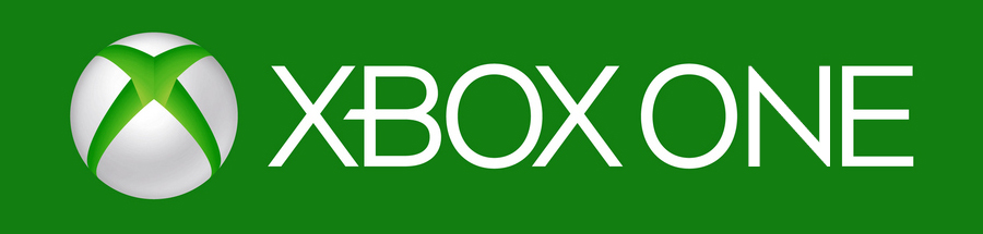
Now that I’ve had time to think about it, I’m much more interested in the Xbox One. At first, I could not get over how the name would bring to mind the original Xbox - every time it was said. I’m getting used to it and starting to like it. I understand why they went with the name. The console and the experience is ‘All in One’. It’s the ‘one’ place to go. This is it, the One. It kind of works now. The one thing I’m a bit annoyed at is the logo. A lazy use of Segoe UI font and ta-da, the Xbox One logo. It’s the letter N that bothers me. I suggest the corners should be angled like this:
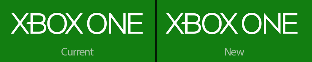
I just think it looks better. The current one looks bland, especially next to the more interesting word ‘XBOX’. Removing the straight edges seems to fit the logo more, in my opinion.
Another design choice I’m not digging too much is the console itself. It looks okay, although it has an uncanny resemblance to a VCR. It also seems a bit lazy on Microsoft’s part. Maybe they thought they really needed to show off the console, after Sony didn’t do so at their event, and chose a prototype at random. So the styling is okay but the shape isn’t, in my opinion. There has never been just a rectangle console before. Most consoles have a shape that can be identified in silhouette. The straight edges of this box is boring. Here’s what I propose:
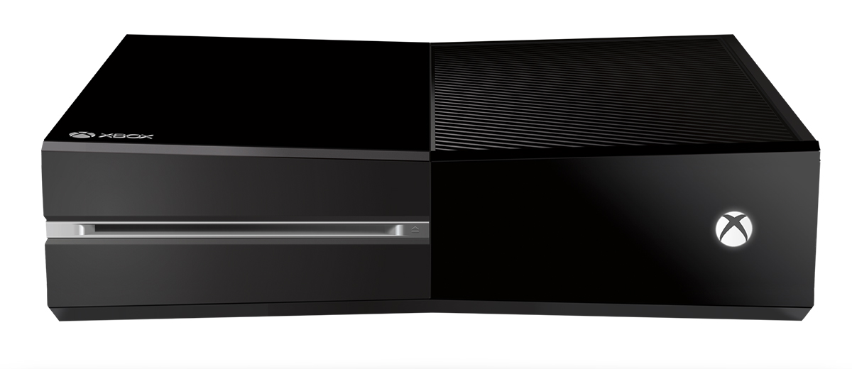 Taking cue from the Xbox 360 and the Slim, I suggest indenting into the middle on each side. It’s a small redesign that I think adds just enough more to be interesting.
So there we go. I really love the instant resume and the app switching features of the One. The biggest issue I have with my 360 is how slow it takes to start up. I really hope Microsoft can win back people at E3 with games. Please remember Microsoft, without gamers there wouldn’t be an Xbox.