August 26th, 2023
Last summer I became aware of Astro, a static site generator that promised a great developer experience and performance. I gave it a go and thought it was very promising, but it was missing a critical feature of my existing blog generator, Jekyll. This year, they released v2.0 with the feature, and I've been so impressed with the framework I had to migrate my whole blog! MORE

August 20th, 2022
I've been using Sublime Text for web development since I left university, and I'm the only person I know who still does. I've gotten very comfortable with it, and the performance is excellent. Everything happens instantly, and it feels like there is absolutely no friction between me and the code - which is really what you want from a code editor. MORE
August 3rd, 2022
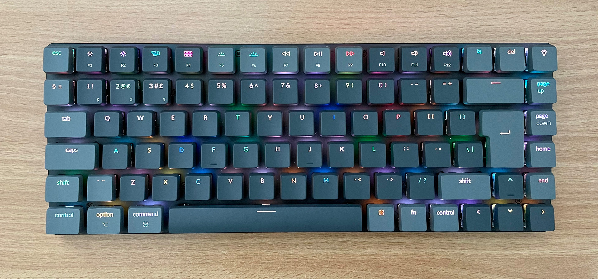
It all started when my mouse broke, which I've had for about five years. The new model was fairly inexpensive so I went ahead and bought it, and was pretty happy. MORE
December 19th, 2021
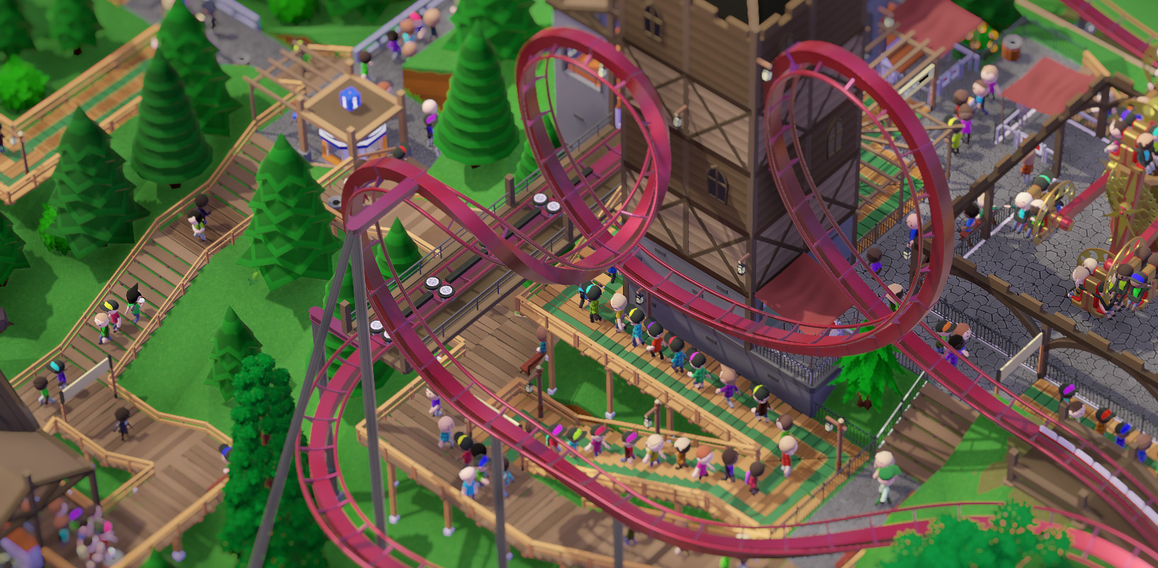
During this year's Steam summer sale I picked up Parkitect, a theme park builder and spiritual successor to Rollercoaster Tycoon 2. And it turned into one of my most played games this year. MORE
November 18th, 2020
I enjoy chronicling my PC builds on the blog, mainly so I can refer back to them when the time comes to upgrade. That time is now! MORE
